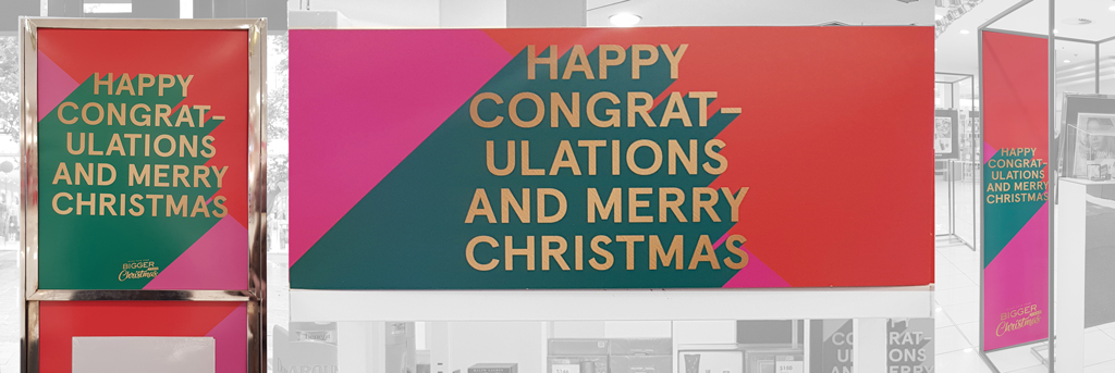
What design and copywriting hell is this from? This is the Christmas motif installed in a major department store chain all around Australia. It has the most awkward copywriting I have seen in a long time. The design is unconsidered and insipid.
Every time I read the copy, my brain glitches and skips:
- In what context is “happy congratulations” ever heard or seen? Maybe it was a machine translation failure? Was the project shipped overseas to a non-English speaking country, and no one checked?
- Is this an attempt to appeal to both the religious and non-religious camps? The “Happy” could have come from “Happy Holidays.” “Merry Christmas” is obviously the religious variant. Even if this were an attempt to appeal to both camps, why not “Happy Holidays and Merry Christmas?”
- Why is “congratulations” hyphenated, even on the horizontal banner where there is clearly more than enough space? Is this a difficulty with English? Again, does no one read this before it was mass manufactured and installed?
- Is the hyphen a deliberate visual design element? Why? How is it relevant in anyway to the message or the context?
- Having the “and” in front of “merry” also reads oddly. The “and” should end the line above. But this is a very minor gripe compared to “happy congratulations.”
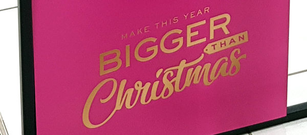
- The secondary line that appears on some banners (shown below) says “Make this year bigger than Christmas.” This is also awkward and meaningless. What does it mean to “make this year bigger”? Is there even enough left of this year to em-biggen?
The design is neither festive nor particularly joyous:
- The magenta and dark orange are reminiscent of toxic aniline dyes. I get the attempt to avoid cliched reds and greens. But this is Christmas. Reds and greens are inextricably associated with the season. I think they can/should be used, in conjunction with more neutral tones to reduce their garishness.
- The grey green reminded me of duck poop and blue-green algae. It is not the rich and vibrant green we associate with the optimism and aliveness of fir trees in snow.
- The layout is boring. Centring everything is a classic Design 101 stumble. The asymmetric slope of the green form hints at more interesting layout possibilities that were unexplored. Perhaps this was a rush job?
- The typeface is more reminiscent of the cold calm directedness of highway signage than the warm fuzzy nostalgia of Christmas.
- The design of the secondary element at the bottom of some banners (shown below) is completely different. Two completely different typefaces are introduced by this element, as well as a luggage tag motif.
- There is no attempt to create an integrated coherent overall composition. The orange-green-pink blocks are just dumped on the banners in three blocks.

There may be any number of reasons for this poor outcome.
- The agency was dealing with a committee who all demanded the inclusion of their individual preferences (“We must have the word congratulations.” “The design must literally tell people to be happy.” “Christmas in a curly font.” “We must use a san-serif modern font.”) without any due consideration for the overall design or the advice of the agency.
- The agency put a junior designer on the project and provided minimal or sub-par supervision. Or the design work is outsourced to another country with cheaper labour. Again with sub-par supervision.
- The design literacy of the agency staff and the client is particularly deficient.
- This was a rush job and no one had time to check anything properly.
This may also be another example of treating design as a frivolous thoughtless activity that produces nothing more than pretty throwaway stuff.
If you were the client, would you be happy with this result?