
Colour in business communications
The use of colour in business communications – on logos, signage, printed documents and websites – fulfils three broad roles:
- Enable effective communications; including meeting any regulatory compliance requirements.
- Implement and reinforce branding.
- Convey group or industry affiliation, cultural and other subconscious messages.
Choose the right colours to use in your business communications, including branding, can enhance or hinder these roles.
Legible
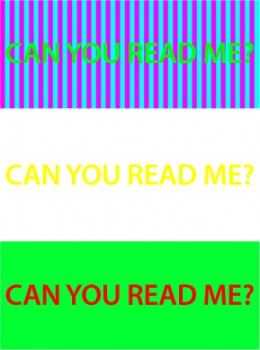
The contrast between different colours can affect legibility. A typical illegible colour combination is yellow on white. Certain colour combinations and patterns can also affect legibility and can cause unsettling strobing effects.
Good contrasting colours also help to ensure black and white copies remain legible. A piece of design using colours can end up being reproduced in black and white; when it is photocopied, printed on a monochrome printer, or faxed.
Some colour combinations, like red and green, are practically invisible to people with colour blindness. 7 to 10% of men are red-green colour blind! There are digital tools – like these Adobe Photoshop soft-proofing tools – to help you create colour-blindness-friendly designs.
The best way to ensure legibility is to test the design with people (preferable those who have not been involved in the design process) of different ages and vision acuity.
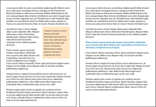
Navigable
The judicious use of colour can help the reader navigate the contents of a page.
Colour can help key pieces of information stand out more than others – such as setting pull-quotes in colour, or placing some paragraphs inside a coloured box.
Branding with colour
A consistent palette of colours associated with your brand can unify all your communications together into a cohesive family. Over time, a colour palette can become synonymous with the brand. Caterpillars are yellow. The tricolore of blue, white and red is unmistakably French.
Using colours that are different from your competitors, or from established industry norms, can help you stand out. A funeral director who uses maroon hearses will immediately differentiate themselves from the others who use the more traditional black ones.
Group affiliation

Colours can also signal your affiliation with a particular group or tribe.
Source: James MacDonald, CC BY 2.0, via Flickr
The Scots have long used tartan colours (and patterns) to indicate clan membership. A modern urban example is the use of gang colours. Italian food packaging tends to feature the green, white, and red combination of the Italian flag.
The opposite is also true. Using colours that deliberately depart from the established associations is a way to separate a business from the status quo.
Some new banks have chosen to use bright purples and oranges instead of the more conservative and traditional muted blues and greys. There is a risk of course, that the non-traditional colours can indicate a lack of experience or stability.
Subconscious cultural messages

Source: epSos .de, CC BY 2.0, via Flickr
As humans are such visual creatures, it is not surprising that specific colours have taken on specific meanings in different cultures. These can be really entrenched and hard to change.
Red and yellow (gold) typically symbolise luck and prosperity in the East. The same red and yellow means danger or “fast food” in the West. Blue and gray tends to signify conservative professionalism in the West. Blue and white can mean death in the East.
With increasing globalisation, it pays to take into account the cultural meaning of colours in all your markets.
Market category conventions
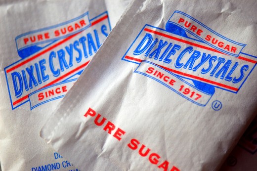
Source: Steve Snodgrass, CC BY 2.0, via Flickr
Established product and service categories can have specific colour associations. You may not want to contravene these without due consideration.
White sugar and flour packaging tends to be blue and/or red on white. Raw sugar and unbleached flour packaging often swap out the white paper for tan or recycled paper. Personal hygiene products are never in browns, yellows or dark reds. Tea and coffee are seldom see in pale or predominantly white packaging. Chicken flavour is often associated with grass green.
A medical practice should not be branded with the same earthy brown and green colour palette of a health food store. An accountancy practice should not have the same palette as a toy store.
Colours of compliance

Source: Jon Olav Eikenes, CC BY 2.0, via Flickr
In certain situations, a business will be mandated by law or industry bodies to use certain colour combinations on their products. Examples are: navigation buoys, and colour coding for industrial gases.
If you are in such an industry, you will probably want to avoid using colours in your communications that can potentially be confused with the mandated colours.
Colour can affect behaviour
Our mood can be affected by the colour of the environment we are in. Our behaviours can be influenced by our mood.
Red and yellow have long be used in fast food restaurants; both to attract attention, and as a subtle hint encourage fast turn-around. Eat and go please. In contrast, McCafes are decked out in more welcoming tans and beiges. Some prisons even have pastel pink interiors to reduce stress!
Road signs use colour to delineate the types of information they show. Yellow signs are warnings. Green or blue signs offer destination or direction information. Brown signs usually point to tourist/sight-seeing routes.
Medical facilities tend to use a lot of white. This reminds people they are in a clean, clinical environment; and to keep it so.
Trends: to follow or not to follow
Colours and colour combinations come and go like any other fashion trend. The colour of the moment (2014) appears to be purple/purple-brown. We are also seeing a lot of secondary colours like magentas, yellows, and cyans.
How closely you choose to follow a trend is dependant on the nature of your business. Not keeping up on a fashion conscious industry may say you are falling behind. Being too eager to follow the trends in a conservative industry may paint you as fickle.
Check your choices beyond “Do you like it?”
Choosing the right colours for your business communications must be more than a simplistic and subjective “Like” or “Don’t Like.”
Compare your chosen colour palette against:
- Your main competitors’.
- Those competitors who are on the fringes; the newcomers, the mavericks.
- Against your suppliers or other brands in related/complementary industries.
- Industry and legal requirements.
If you sell to a global market, get a good sense of what other brands and products use similar palettes to yours. You don't have to try to mitigate every single possible pitfall of course. Indeed it is impossible to do so, and to try is to inevitably end up in a most-common-denominator situation which usually doesn't serve anyone at all!
Image: Colourful business via Shutterstock.