There are three examples of a functional design fail that really should never happen outside of a design school. These were spotted in an Oslo design museum of all places!
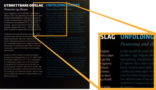
Dark cyan on black with a thin typeface.
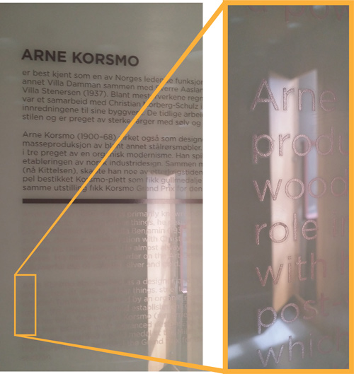
Light silver on translucent white. (Maybe it was supposed to be backlit. Even then, using light silver on white had deliberated created a failure point where the design only works when back-lit, when it didn't need to be so. The designer's choice has reduced the resilience/robustness of the design.)

This yellow on red was barely legible.
I think such failures point to the loss of context awareness during the design process.
Sitting at a desk with a bright, big monitor, armed with the power to fluidly zoom in and out to see even the most minute details clearly; it can be really easy to forget the actual use-context.
In the real world of dimly lit museum rooms, stuck on walls just a little too high, too low, too far away, or tucked behind objects; the legibility is often drastically compromised relative to the design environment.
The simplest fix is surely to print out a sample and take it down to the actual exhibition space?!