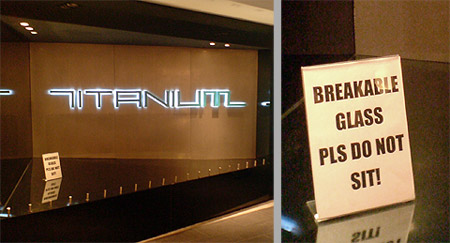
I saw this unfortunate shopfront last weekend. It was a brand new CD shop in a brand new shopping centre on Orchard Road in Singapore.
The “Breakable Glass Pls Do Not Sit” sign jumped out like the sore thumb. The funky but hard-to-read word “Titanium” (I think) does not help matters.
This is a great example of design happening in a void. Design that is divorced from reality, context and any awareness of human behaviour.
The shop is right next to escalators. This makes it a great meeting spot for tired shoppers. The ledge is set at sitting/perching height. Which mean people will try to sit there while waiting for their friends etc.
So what does the designer do? Make the surface out of a breakable substance of course. Then try and fix the problem post-installation. First we put the studs along the front to make the surface less comfortable to sit on. When that did not work, we put the crappy “Breakable Glass” sign in a super-prominent spot. What’s next? A spotlight on the “Breakable Glass” sign?
This sort of myopic problem-solving completely misses the point. “Titanium” – the intended focal message – is already damn hard to read. The only reason I even know it is “Titanium” is because I had photos. I certainly did not remember looking at the word when I was there.