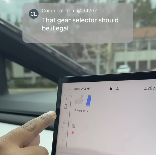
Just because we can, and it is “cool” and trendy, are not good reasons to do something. Especially when it compromises functionality and safety.
In the pursuit of the next cool thing, designers may be increasingly losing the hard-earned user interface lessons from the past. The design of the gear shift of the Cybertruck is a worrisome indication of this.
A driver’s primary attention should be on what is outside the vehicle. No one can argue with that. We have strict laws against using phones when driving for this reason.
Using a touchscreen and swipe motions to change gears poses a significant distraction risk. Without any tactile feedback of physical controls, the driver must look down (however briefly) to locate their finger on the touchscreen. Touchscreens are also more sensitive to accidental triggering than physical switches. I can imagine drivers becoming distracted when they accidentally trigger another function on the touchscreen on the way to changing gears.
Having observed many people using the swipe motion on their phones, the precision of this gesture seems significantly imprecise and variable. Some swipe quickly, using a more flick-like motion. Others trace the movement more slowly. This variability should raise alarm bells from the operational perspective. A touchscreen also does not provide any physical feedback on the activation of a control. There are no notches for the stick to engage, that the driver can feel without glancing down.
The backup control of placing (what looks like non-tactile) buttons above the driver near the rearview mirror is also bizarre and dangerous. Firstly, it is not a standard location for the gear change control. Secondly, it also requires the driver to take their attention off the road to activate.
Are designers losing touch with the problem-solving, cognitive/critical, and human factors aspects of the professions? In doing so, are designers increasingly eschewing “design” for mere “styling”?
