The recent Hawaiian missile warning mistake piqued my interest in just how the user interface of the WAS alert system may have contributed to the mistake, and how it could be improved.
The screen-grabs used below came from here; thanks to Peter R for the link. I am guessing they are part of a single screen and the process is a linear flow from top to bottom without branching. These may or may not be the actual user interface in use. But this does not detract from my points.

I can see two potential improvements to the existing design. Figure A shows the start and end parts of the existing design. Figures B and C are my modifications explained below.
Start by making the most important decision.
Test vs Real is the most important decision of the process and sets the context. As such is should be made up front.
Because the implication of mistaking one for another is clearly quite serious, the choice of Test vs Real must be clear, obvious, and unambiguous.
The current design opens with a prominent yet redundant checkbox (Send EAS Alert.) The important choice of Test vs Real is presented as a choice of two templates, in fine print.
The choice of sending a Test or Real alert could be presented as two obvious and clearly delineated choices. See Figure B.
Don’t branch into a distraction.
To add further context confusion, the current interface also seems to allow editing of these templates. The user has already made the decision to Send EAS Alert. See the purple block in Figure A.
Editing should be a completely separate process with a separate user interface.
Clearly indicate the current context.
Once the most important Test vs Real choice is made, the screen should change colour to reflect this. Perhaps turning red when a Real alert is being prepared. This obvious colour change will then function as a constant reminder throughout the rest of the process. See the red blocks in Figure C.
With the big picture decision made, the user can now focus on the details of setting up the message.
The activating action should be clear confirmation.
The final step then becomes a single, obvious button - to confirm sending a Test Alert or a Real Alert. See bottom of Figure C.
The existing design asks the user to make the Test vs Real choice again. The surrounding explanatory messages add even more confusion. See bottom of Figure A.
Don't forget the user.
Good UI and process design are only parts of the whole picture. The user's actions obviously play a critical role.
With the revelation that the Hawaiian missile agency stores their passwords on post-it notes, the user's knowledge must also be taken into account too. Some awareness and training are clearly needed here.
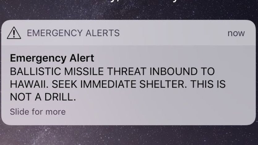
Feature image from http://www.bbc.com/news/world-us-canada-42677604