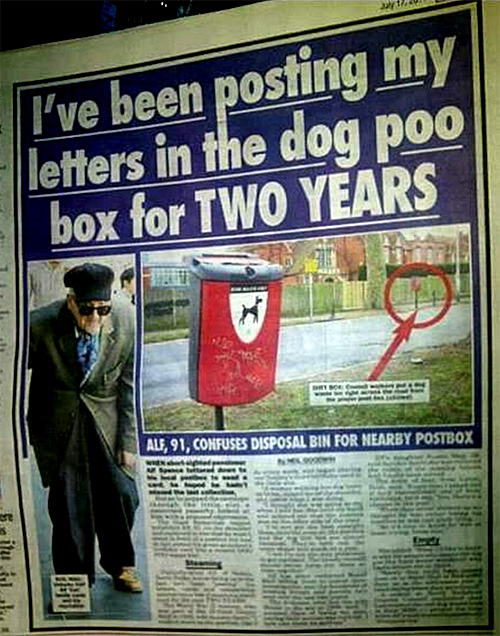
Another example of when designers fail to take into account the use-context. They failed to take into account other common, and potentially confusing, memes in the deployment environment. They just made a red box. Perhaps because they or the client liked red.
A red box with a slot in a public place, in many countries, subconsciously signals a letter box. Having a sign of a dog, or even one that literally says "litter only" on a red box with a slot is still bad design. Both are symptomatic fixes after the fact.
The better approach would have been to use a completely different colour, and a different shape even.
But I guess that would have required a level of awareness beyond the computer screen.
Photo and heads-up from Julia Reingold.