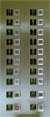
 This is a (crappy) photo of the buttons panel of a lift I have been using 4 times a week for almost 8 weeks now. (More legible diagrams below). Every time I use it, I always had to pause to consciously find the floor number I wanted. This struck me as most odd. So here's an attempt to understand why this is so.
A lift's control panel must be easily and quickly legible. For this to be the case, it needs to work as much in synergy with how people already access and process visual information.
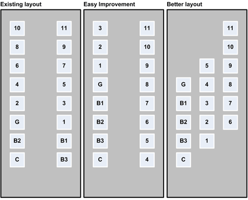
We are trained to expect serial information to be presented in a serial/linear fashion. In this case, we would expect the numbers to increase from the bottom of the list upwards. This also correlates with our understanding that higher up = larger numbers.
The existing layout is hard to read because it breaks this expectation. It forces our eyes to jump the gap from the left to the right column, and then up and to the left again. This is made even harder because the difference of the gap between the columns and the gap between the buttons in each column is very high. This means our eyes "prefer" to read from one button to another up and down each column, instead of jumping the gap between the columns. The wide gap also makes it harder to line up a number on the left column with its neighbour in the right column.
Put another way, this is like trying to read a newspaper where sentences skip from one column to the next as you move down the page. Nasty.
An easy* improvement would have been to run sequential numbers up the column. And moving from the left to the right column when we run out of numbers. This unfortunately now go against our expectation that higher up = larger numbers.
(* Easy as in easy for the manufacturer because no-re-tooling required.)
A better layout would be to satisfy both expectations. Numbers increase as you move up the list. And the larger gap between rows signal that you are supposed to read from left to right, before you jump up a row.
Grouping buttons in threes also makes it easier to read. We seem to like processing options/choices in sets of three, five or seven.
In the existing layout, the Braille numbers in their black blocks also adds unnecessary distraction and emphasis. Our eyes will focus on the black squares first, but they are not buttons! Ironically, not only do they not provide useful information to the sighted, they actually get in the way.
An elegant way to integrate Braille numbers would be to simply emboss them onto the button faces, and leave them unpainted. Braille numbers don't actually need to be visible.
Oh and one more thing, making the G button slightly more obvious, perhaps with a thicker printed outline around the button, will help users orientate themselves better.