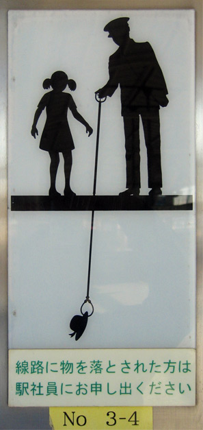
Isn’t it interesting how detailed the illustration is? And how clearly it communicated the message?
I am normally a fan of very simple and unfettered geometric forms for signage, but this has a unique charm that works.
It goes to show that you can use whimsical, decorative elements to create something beautiful that still fulfills the design intention.