When you have no real differentiation, and you are selling a commodity product, and you don’t really give a damn about doing any better; you resort to gimmickry.
I had a case of deodorant can failure this morning. I pressed down on the trigger of a new can and no freshness came out. I looked closer at the can and saw this:
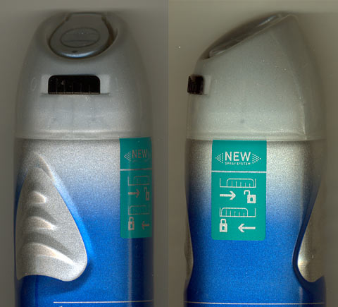
WTF?!! Someone invested effort, brain cells and money coming up with this. And manufacturing it in the millions. What’s it for? What real world dire problem does it actually solve? Nothing zip zero nada that’s what.
Oh yeah, get those man-sized grips! You really NEED those to stop the can flying out of your grip at Mach 5 - after you have figured out how to work the damned thing of course.
This is anti-design. Another stupid pointless wasteful and ANNOYING gimmick. It comes set to the “0” position so customers now have to stop and figure out how to use an aerosol spray. They even had to print instructions on how to use the new inconvenience. Not that this has been thought through properly. Given they have moulded “0” and “1” next to the switch, why not actually mould the lock and unlock icons instead and dispense with the printed graphics? Oops, I have just moved into turd-polishing territory.
It is so stupid I expect to see the same mechanism on all sorts of aerosol products shortly.