This floor signage design is currently in a major departmental store Australia-wide. I wrote about their poor holiday motif here.
Apart from being pretty and colourful, it is a pointless, useless, actively confusing, and wasteful exercise.
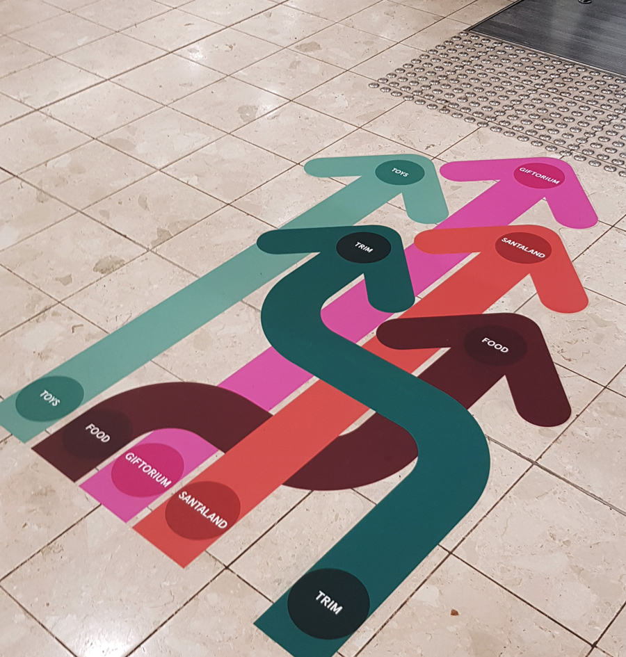
- The colours have no functional significance beyond matching the Christmas palette of the store.
- The directionality of arrows are redundant as they all point to the escalator.
- The bends in the arrows are actively confusing as they make no sense whatsoever.
- The text is too small to be legible for the older demographic of the store.
- There is no reason to set the text inside circles. The circles add to the pointless noise of the design, and force the text to be smaller.
- Repeating the text is both a symptom of the unnecessary confusion caused by the arrows and also adds to that confusion.
Installing these signs in front of elevators could actively impede the flow of traffic. That is what you do not want in a department store during the Christmas shopping season.
The noisy distraction of the design takes attention away from the merchandise. It forces customers to stop and process useless information, information that is unrelated to selling products!
Is the the result of design by committee with a client that is too hands on and not aware of their own lack of ability? Is this the advertising agency putting an inexperienced junior on this project? Has the agency simply failed to consider the context of this design (visually noisy environment, need to maintain traffic flow etc.)? Is this a reflection of lower standards in design training?
I don’t think this client got value for their money.