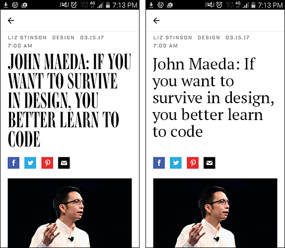
I took the screengrab on the left. And mocked up the one on the right.
It still astounds me how often I come across illegible designs. I can understand why the designer chose the typeface on the left. It does have a rather run, rhythmic quality to it. It conveys an appropriate feel (“funky and cool, but still serious”.) But it is borderline illegible; especially on the small screen of a smartphone.
Usability is not just limited to user interfaces of systems and objects. Usability needs to be given more emphasis in all areas of design, including graphics. Choosing look over functionality is the designer letting their ego get in the way (like we see in much of fashion design.)
As more and more graphic design functions are taken over by automation and templates, a designer who unknowingly makes something less legible, less functional, may not survive long in the industry.
If you want to survive in design, you better learn to make stuff legible!
(And John Maeda is also right, learn to code too. You won’t regret it.)