This ad’s closing shot has always annoyed me.
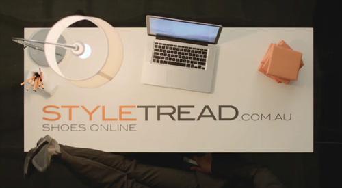
The composition of the (very brief) closing shot focused primarily on the computer, which really had nothing to do with what the ad is selling.
This was probably intended to say “online” but failed as the shot angle focused on the computer as the subject. The composition says “computer on a table” not “buy shoes online.”
There are other oddities with the shot as well (now that I am staring at the still). The seam on the lampshade should have been removed or rotated towards the top to reduce its prominence. The objects scattered around the table act as unnecessary distractions, rather than being strategically arranged to point at the “product.” Or just removed. The pile of terracotta tiles(?) look weird, and is made more prominent by its isolation on the top right corner. The man’s legs could have been a powerful pointer, but they are pointing off screen. And his hand on the chair arm is another unnecessary distraction.
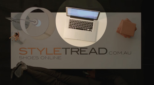
I suggest sacrificing continuity from the preceding scene and just cut to a simple unambiguous shot like the mock-up below. Better?

Other than the closing shot, the ad is otherwise quite nice and on-point I thought. Watch it here: