Following on from my post yesterday on busting the myth of the fold in web design, I spotted the beautiful layouts of Choice magazine's website.
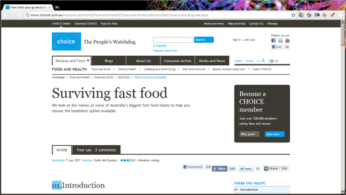
Shown above is how the layout looks on a 1366x768 resolution screen typical of many consumer laptops. See how all of the article content is actually below the fold! (And remember, the fold is different on different monitors.)
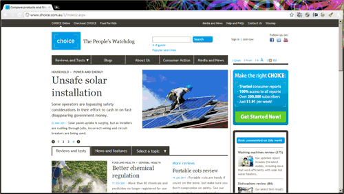
Even the home page is calmly sparse. With most of the content below the fold also.
The bottom line is this: People will scroll to get to content that interests them. And yes, it is 2010 and those who use the web all know about scrolling.
If you are still agonising over fitting everything above the fold, you are looking at the wrong problem. It is not the fold, but your content. Are you giving your audience compelling and relevant content that is worth their while scrolling to?
Visit Choice magazine