A recent email announcing the Mercure hotel group’s new website was a perfect how-not-to-do-it example of unconsidered, unthinking and self-centred communication design.
I present the Before with my immediate responses (as a customer):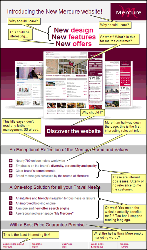
Note I have cropped away some extraneous stuff to reduce the size of the images without sacrificing legibility.
And this is the After; a proposed alternate solution that actually tries to take into account the customer’s interests and wants:
The original was clearly written by management and/or the supplier responsible for designing the new website. Or perhaps even their official advertising agency (good grief). It is arrogantly self-centred in just about every which way. Note to Mecure management – your end customer does not care about your brand commitments, reflections of your values, communicating your values to your teams etc. These are empty words devoid of emotive connections and context.
Your customers want to FEEL your brand values. They want to see your ACT on your values. Unfortunately the current email says: we are totally absorbed with our navels.
Any attempts at highlighting customer benefits were seemingly tacked on as an after thought. The real meat is more than halfway down the page. The big area dedicated to the image is wasted showing what appears to be an airline booking site. It does not excite me at all. This has nothing to do with the design of the site, but how the design is communicated to the customer – from a benefit viewpoint. Why not show a close-up of a “My Mecure” personalisation feature – so as a frequent traveller I can immediately get how it will benefit my lifestyle? Assuming these are real features and not some empty marketing promise.
The “One-Stop Solution” etc copywriting is safe, uninteresting and poor. But at least it is about customer benefits.
The “With a Best Price Guarantee Promise” seem to hint at a unique value proposition. But mysteriously there is no information, and no call to action. I am forced to guess as to what this is. I had to manually Google it to find out! Who signed off on this?!!!!
The links across the bottom continued the “we care about ourselves first” attitude. The first and last links should be reversed! As a customer, I care first and foremost about Special Offers; and I may never care about learning more about Mercure. Let’s be honest, how many of the staff of Mercure, in your 700 unique hotels worldwide, have actually clicked the Learn more about Mercure link?
(I know design projects can be hard with many different conflicting factors. I know decision-makers have their own agendas/egos that make them miss the big picture altogether. I know clients sometimes wilfully do things to their own detriment. I don’t know what went wrong with this project. But something did and the end result was woefully crappy. Not good enough for such a global brand.)