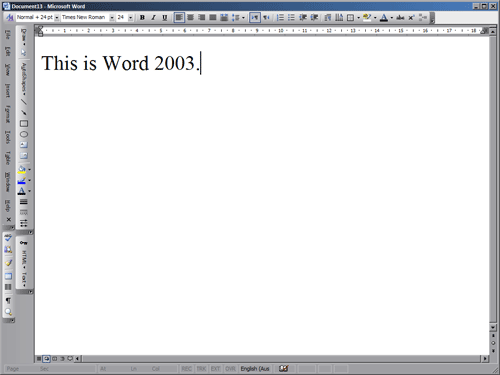
One of Microsoft’s all time crappiest “innovation” has to be the hide-unused-menu-items function. It’s like an evil house-elf that hides infrequently used things such as the first aid kit and the fire extinguisher…


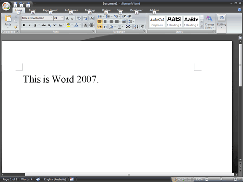
Is the Office 2007 ribbon interface yet another way to hide stuff from me? And steal my screen real estate at the same time?
I totally appreciate the effort it would have require to group the controls just-so; the groupings are about as sensible as anyone can make it I think. The major issue I have is that more often than not, it is impossible to represent concepts like “mail merge” with a small, static icon. Ambiguous icons plus stacked text labels are just harder to read, and takes up a lot of room.
The ribbon has also debilitated our innate ability to remember the location of things (ie menu items). I can’t tell you where exactly a particular command is from conscious memory, but my finger can always remember the location of that menu item. This requires that menu items stay in their allotted positions – which is why the hide-unused-menu-items function was so appallingly crappy. Because the ribbon replaces the whole area with new buttons every time I select a tab, this destroys that spatial memory. So I waste a lot of time repeatedly looking for common things. Imagine if all the clothes in your drawers move around depending on the direction you are facing when you open them!
Microsoft’s developers must also all work on wall-sized monitors. The ribbon takes up a lot of vertical space, space that is already under severe threat from the prevalence of widescreen monitors. I cannot make the ribbon vertical – which I can do in “normal” Word to give me the maximum screen height when working on documents.
Yes there is an auto-hide function, which then slows me down because I need to first reveal the hidden ribbon before I can then see where I need to click next. Yes I can double-click a ribbon tab to hide it (found this tip on the web). But now I have to do way more clicking to choose a “menu item” than before. Instead of scanning a single list in a traditional menu item, I now have to scan a matrix of icons and text. Do I need to point out that we are better at scanning vertical, single-column lists than horizontal multi-column matrices?
I am exploring OpenOffice.org now as a permanent replacement. Office 2003 will remain as my mainstay in the meantime.
(The one good thing about Office 2007 is the in-built design and layout shortcuts. For the first time ever, these predefined styles are actually worth using. This is not enough however.)