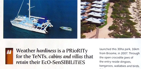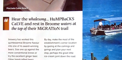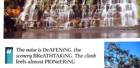
There is some odd typography in the December 2009 issue of Qantas magazine I picked up recently. The pull-quote that starts off each page of at least two of the articles used an odd, distracting and definitely non-standard mixture of capital and small letters. I am not sure if this is some gimmicky new trend, or a Caps Lock key malfunction. Can anyone shed light on this?


Coincidentally, a resume came into my in-box yesterday from a copywriter/proofreader who used this exact mix-and-match casing as a decorative technique. Needless to say, it was most unfortunately inappropriate.