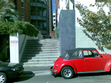
Here’s another example of design done in piecemeal isolation; divorced from the wider context of its application, the environment in which it is deployed. The design in question is the street signage of a set of townhouses all of which share a single street entry. The failure of this design affects multiple households.

Front street, there is actually no visible signage. As you drive past, you see nothing. The street is not a straight road. There are single houses as well as blocks of units. And to make matters worse, there are no neighbouring numbers on this side of the street.

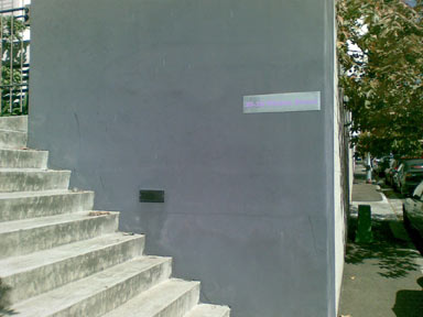
You only see the relatively tiny sign with the critical information when approaching on foot. Well, you see a shiny metal plaque that maybe perhaps could possibly if-you-are-lucky hold some useful information.

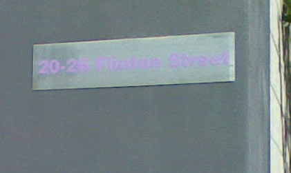
To complete the picture of sheer incompetence, the designer has chosen a pale lilac colour for the already small sign. This lilac colour is unfortunately, or deliberately, about the same brightness/luminosity as the gray of the metal. This effectively renders the sign impossible to read unless you are a metre in front of it. This photo was taken in bright daylight.
I am sure the typography and colour looked perfect when isolated on a white piece of paper. Try as I may to be kind, I cannot describe this in any other way than sheer incompetence.