Here’s an example of how good signage ought to be done.
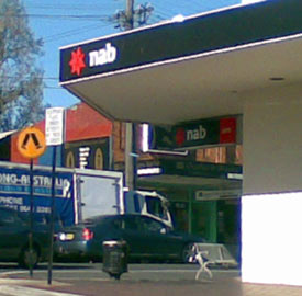
The designer has considered the contexts of use: people who are driving past or looking for the bank from a distance (the logo appears on the edge of the awning for maximum distance visibility), and those on foot (the logo appears closer to normal human height under the awning).
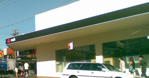
The designer also showed restraint by not simply filling all the available space with the logo. This would have created noise which will be ignored by most people.
The relatively large expanse of black actually helps to draw the eye towards the logo. Positioning the logo towards an edge also helps visibility as we tend to be visually drawn towards the edges of objects.