I came across this website which really how not to do a first contact experience on the web.
Here's the engagement process:
1
When I first arrived, there was a blank area in the middle of the page. So I started reading the text on the right.
2
 Suddenly this Flash element appeared, and pushed the text off to the right. How rude!
Now I couldn't read the text.
I also immediately expected to see an ad, which was not a positive thing.
3
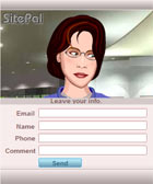 Having distracted me, I turned my attention to the Flash element.
When I realised this illustrated woman was speaking, I had to scrabble to turn the sound on as normally I have my sound muted.
She said "welcome" (in a somewhat mumbling voice) and proceeded to direct me to "click here to talk to one of our mobile representatives". At least that is what I thought she said.
 Try as I might I could not get her to repeat what she said! Important information could not be repeated on demand. What's the point?
All she did was dumbly look at my pointer (aka cool effect about 20 millions years ago). I then had the bright idea of right-clicking on the Flash and choosing Play; as you would any Flash movie. I killed her! I actually got a blue screen! Now why would you choose blue as a background colour for your error frame given its popular connotations?
Many people don’t have their sound turned on. Many desktop PCs in offices don't have built-in speakers or conveniently attached headphones. If they did have sound turned on, springing an audio track on someone unexpectedly is very rude. There is no way to know how loud they have their speakers turned up to. This could well be the technical equivalent of jumping out at unsuspecting customers and shouting at them.
4
Ok, she said something about clicking "here". So where is "here"? Clicking on her did nothing. She just kept looking stupidly at my pointer. Now I am confused.
(If I moved my pointer a certain way I could get her eyeballs to do some really crazy moves. I wonder if they have a version that spewed pea soup?)
At this stage my attention was all on her, and not ANY info about the business itself. This cannot be good for the business.
5
 But wait, there's more. When I scrolled down the page, I saw this button.
Now there was a photo of a man and not an illustrated woman. Could he be more helpful perhaps? At least his eyes were not following my pointer around the screen.
The label indicated he would perhaps give me a phone number to call, maybe.
Hold on, the link goes to a completely different domain. A potential phishing scam? Something dodgy? That .aspx URL could execute some malicious code...
6
I risked it.
Clicking on it led me to this screen with useless graphics and confusing information.
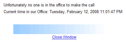
No one to answer the phone late at night is fine. But what is this line about "no one at the office to make the call"? Call to whom? Did I request a call to be made? How? What did I do?
And what's with the faded blue bar? And the Close Window link that did nothing?
At this stage, several precious minutes into the exercise, I still had no idea how this business could benefit me. What I know is that they have confusing and annoying things on their website.
All these may seem like nit-picking, but they do add up to project a sense of amateurism, unease and unreliability about this business. (The name CAD Partners also did not help as CAD for me meant Computer Aided Design. But that's probably just me.)
If this is the level of attention they pay to their communications with me before I am even a customer, how am I expected to trust them to look after the finances of my business which presumably required even more attention to detail than a mere website?
If their blurb is to be believed, they are hardly a two-person business operating out of a garage. Their focus was clearly on gimmicky technology rather than helpful information of real substance.
This sort of stuff may well look interesting to the CEO during the one-off design presentation. But have they considered how a potential customer would experience it? Clearly not.
Their money would have been better spent on information design and copy writing - to reduce the text and structure the information presentation that actively supported the needs of customers and the business. Better HTML will also help, so text does not get pushed off the visible frame.
A bit of thinking and planning never hurts. Especially as they themselves are selling thinking and planning!