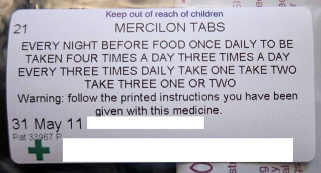
Facebook served up this image. The source is unknown.
It looks like someone mashed all the options when composing the instructions. These appear to be the options:
- Every night before food
- Once daily
- To be taken four times a day
- To be taken three times a day
- Every [some unit of time]?
- Three times daily
- Take one
- Take two
- Take three
- One or two
I don’t know how these instructions are composed. I am guessing it could be some sort of point-and-click templatising tool within the dispensary software. Or manually assembled via cut and paste. Or a Word-macro, perhaps?
So, why isn’t this tool or process preventing or identifying such obvious mistakes?
Why does the software/process even allow the selection of obviously conflicting options? Where are the basic fail-safes? The designer and developer don't even need to have specialist knowledge to know that some of these options are mutually exclusive.
Surely in such an instance, a higher level of competent base-functionality is warranted?