As part of any user experience (UX) design, we need to consider the feel of the service or product for the end user in their use context.
Smartphones and tablets feel smooth, fluid and fast compared to PCs despite having significantly less powerful microprocessors because their user interface has been engineered to prioritise responsiveness at the expense of slowing down non-interactive processing tasks such as applying a filter to a photo.
This separation of "feel" into perceived (real) feel/performance and raw (actually quantifiable performance) performance is akin to the distinction between measured temperature and the "real feel" in weather forecasts.
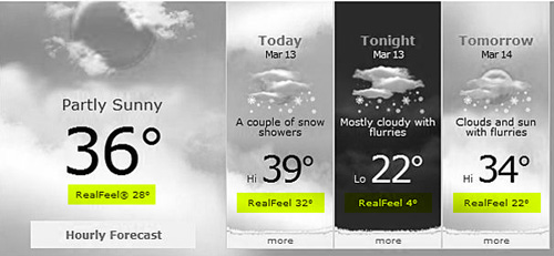
Accuweather.com's RealFeel temperatures vs actual measured temperatures.
The real feel of 25°C can vary from mild to chilly depending on the humidity, sunshine and wind - relative to what the "user" is used to.
The user's context is clearly critical. In financial records processing, the UX feel priority will be on raw power and concise feedback, rather than the fluidity of the user interface.
Waiting at a pedestrian crossing with a countdown timer will always feel faster than one without. This is one of the reasons for animated progress bars on software: to reduce the feel of waiting.
Having implemented a countdown mechanism, you would want to maintain its trustworthiness, without which you would frustrate users more.
Years ago, Sydney's CityRail used to repeatedly reset the "Due In" indicators on their station boards to make delayed trains appear as if they were on time. Just when you thought the next train was one minute away, the board will suddenly change to 10 minutes. The real feel of the delay became longer than the actual quantifiable delay times!
And they would completely remove a severely delayed service from the board suddenly. This effectively "merged" the missing service into the subsequent service; which was by then, of course, running severely early! Again, this sly disappearing act just increased the real feel of the delay.
From a UX perspective, they would have been better off not providing the countdown at all.
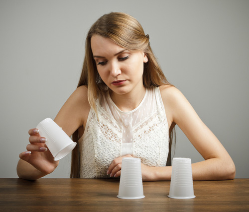
Image courtesy Shutterstock.