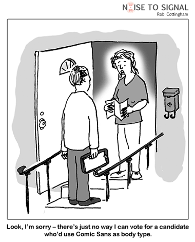
This excellent Rob Cottingham cartoon reminded me of a similar personal experience a few years ago.
Someone I had a ... let's say disagreement ... with years ago used to send me pompous letters printed up using Comic Sans. The laughably absurd, self righteous content of those letters, tripped up in pseudo-legalese, was matched perfectly with the frivolous irreverence of Comic Sans. I didn't think they were doing this deliberately for my amusement.
The lesson here is: if you are not a designer and don't want to hire one, stick to classic (and yes, potentially boring) typefaces like Times New Roman and Arial. At least you will remove the risk of conveying the wrong impression.
Hat tip to Kris Rao for pointing me to Rob's site.
(Ok, maybe if you ran a childcare centre, a toy shop, a party supplies shop, or an amusement park you can get away with using Comic Sans. But definitely NOT if you were a legal, financial or medical professional!)