My friend Tanneke sent me links to two restaurants we could go to tonight. I have to decide which one. So I went to the sites. Note I was sent the direct links to both their menu pages.
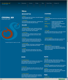
I immediately became engrossed reading the detailed menu on the Original Sin site.
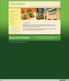
By comparison, the Doc Green's site appeared lacking. It is interesting to note that the Doc Green's page is the only one of the two to show images of food. And that the Original Sin page is blue - which is not a colour traditionally associated with food.
Intuitively, I would have thought less info, and less blue, would be more welcoming, food-like, and less intimidating. In this case, it turned out that presenting all the detailed info of the full menu was more appropriate to what I needed. Isn't this was interesting?
Incidentally, I plan to try both places. So please don't take this as any commentary on either establishment. This is also not a commentary on the visual design of either site.