I walked past these two interiors last night.
Similarities:
They are both customer service / retail spaces.
They belong to two large corporations – Telstra (a telco) and MBF (a health insurer).
Their design employed more or less the same materials (stone, glass, wood).
They used the same lighting was (metal halides).
My guess is they probably cost more or less the same to fit out, excluding the cost of the electronic gear.
They are both in prime locations in Sydney's CBD.
At a quick glance, they seem to look similar. Or do they?
On closer inspection, the two designs evoked very different responses. They felt very different indeed considering all their similarities.
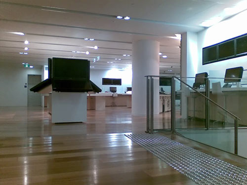
This photo is of is Telstra's new T[life] shop. (And yes, the inappropriate use of punctuation as visual decoration seems to be back again.)
The HUGE double plasma screens mounted to resemble gigantic unwieldy laptops dominate the space. There are eight of them – that is eight pairs. The size of them totally dehumanised the space. They also appear to be mounted on flimsy and cheap white melamine on chipboard cabinets. I have no idea what they are for.
There is little rhythm, life, colour in this space. Maybe this is so the colourful content on the screens will take precedence. I don’t know. But with the screens off, and the stark bright halide lamps, the space just looks nasty and unpleasant.
Most of the "workstations" are stacked against the wall, much like a classroom or work cubicle. Perhaps they expect the wide open spaces to be thronging with people most of the time.
There is a staircase to the left (not shown in the photo) which has not really been integrated into the design.
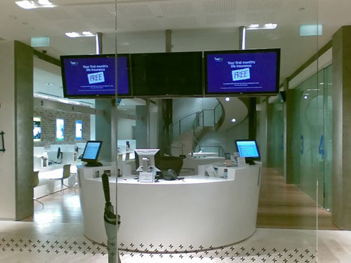
This photo is of MBF's reception area. This feels so much more comfortable and welcoming. The lightning is set up to create pockets of focus – on the main counter for example. There are more distinct pools of light; the space has not been flood-lit like a crime scene.
The furniture and fittings are more human-scaled. There are no huge pieces of technology dominating the space. Though the three plasma screens come close.
There is subtle use of colour. Note the colourful wall to the right where brochures are displayed. And yet restrained, as most of the space is still in neutral tones. The glass panels and big blue numbers add movement to the space.
The staircase at the back is used to good effect as a distant focus, drawing the eye into the space.
Design can create very different outcomes from the same material. The briefs for these two projects would have been quite different. As are the clients. The design outcomes will affect customers' perception of these two companies.
I wonder how well the two interiors reflect the core brand essences of the clients?
Which do you think would provide more professional and/or better personal service?
Is one of them more about caring for customers? Or blowing their own trumpet?
Which interior came across as more self assured and confident? Or brass and loud?
Is one of them look "cheaper" than the other?