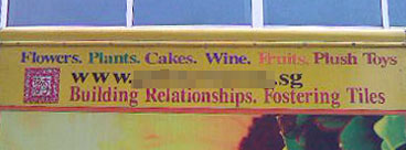
Nice tagline – inexcusably crappy execution. Like this recent cockup by the Max Planck Institute.
The obvious fail aside, there are other wonderful lessons nicely demonstrated by this one sign.
No hierarchy of reading – the actual information on this sign (the text and logo) more or less have the same visual weight. They are all jammed in to the top edge of the sign. This makes it impossible to read if you were driving past. The most important piece of information – the name of the store – must be the most prominent.
Too much information – instead of just showing the name in this already-cluttered sign, they made the mistake of showing their full URL including the “www”. Many web addresses now work without the “www” which makes for a shorter URL.
Illegible and generic logo – the use of a chop is clichéd and unoriginal. The ornate nature of the design and the stylised fancy script makes for a logo with absolutely zero identification value.
This also adds useless clutter to the sign. A red square is already a powerful visual presence. This is even more so when set amongst a regular run of type.
Too many almost-related offerings in the first line. This forces people to think too hard, and is a potential barrier to entry. How do you feel about buying cake from a florist? Seriously.
I reckon – either show offerings that are reasonably related, or go the other way and show grossly unrelated ones. So, use “flowers, plants and gift baskets” or “flowers, ”. That way, you don’t make people think too hard, or you make them remember you for the (deliberate) quirkiness.
Perhaps stating benefits would be more useful as a differentiation point: “Yay ~ Love ~ Sorry ~ Condolences”?
However…
At the end of the lesson, this is probably a perfectly good business with happy loyal customers. The bottom line is: If you want to do something, either do it properly, or don’t.
(This sign was spotted, snapped and MMSed with great enthusiasm to me by Tanneke. Thank you!!!)