When you design small and just scale up to a larger size, it can look weird. What looks great at the size of a brick can look disturbing enlarged to the size of a car.
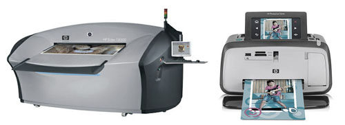
The photo above show two HP printers. You can see they share the same design language*.
The one on the left IS the size of a car! That is a normal-sized LCD monitor attached to its right hand side. There’s a pic of a man standing next to it on Deputy Dog, where I first spotted this.
I am not the only one to find the design uncomfortable, Have a look through the comments.
Architects will be familiar with this challenge. A model of a building can look really nice sitting on a table top. When built, and with all the detailing scaled up to life size, and with the perspective coming from street level rather than a helicopter, the design can come across very differently.
The same challenge also exists for graphic designers. What looks great on a desktop monitor will look markedly different at the size of a two story mural.
Designing at the right scale, and evaluating within the right application context, are very important!
* I dropped the colour saturation of the photo on the right. The original had a brighter-blue front panel. For the purpose of this article, this helps to focus on the form and shape of the printers without the distraction of a slightly different colour scheme.