When I clicked on the Compare Products feature on the Sony site, this window popped up. It only took up a quarter of my screen. There is obviously quite a lot of content.
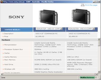
OK, I will make the window larger so I can better scan through the table and make the comparison. And ... I get the annoying stupid result shown below.
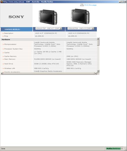
All that screen space and I am forced by the stupid designers of Sony's site to piss around scrolling and peering at a long list through a tiny area. Instead of making the comparison which would hopefully lead to a purchase, I am now getting annoyed scrolling through the damn list when all that blank window space could have been used.
The designers would have had to go out of their way to write extra code to retard the inherent functionality of the browser. They chose consciously to make it hard for me the customer. Come on Sony, you want to piss me off or encourage me to buy something?
Oh yeah, the tiny light grey type on a lighter grey background is also dumb dumb dumb! Sure it is fashionable, but since when does fashionable automatically equals usable or sensible?
Why is it that as customers get older, designers increasingly produce harder to read crap. Why? Because it looks nicer? Looks over functionality. That is the essence of the Sony brand?
Two immediate improvements - make the type size larger by just 2 pixels; and stop screwing around with the browser windows. Let windows be windows, and let text flow to use up all the available space. That would help the customer.
Would Sony care enough to make these changes? Do they have to care?