While shopping for a new television, I discovered that some retailers are putting actual facsimiles of their paper catalogues online (as opposed to other retailers who have searchable, database driven web catalogues).
While I can understand the cost-saving and ease of repurposing paper-based content with a scanner, the Internet and paper are two completely different media and requires different approaches to ensure usability and legibility.
Legibility is first and foremost my concern. With paper, you get much higher “resolution”; with type remaining legible at down to 4 points in size. By way of comparison, Word’s default font size is 12 points. You can also see the entire page on paper, whereas you will likely need to scroll to see the same amount of info on a screen.
Usability is also an issue, especially when web technologies such as Flash are used unthinkingly and inappropriately.
In the examples below, the window size is set to a resolution of 1024x768 pixels, which is a standard 15” LCD monitor.
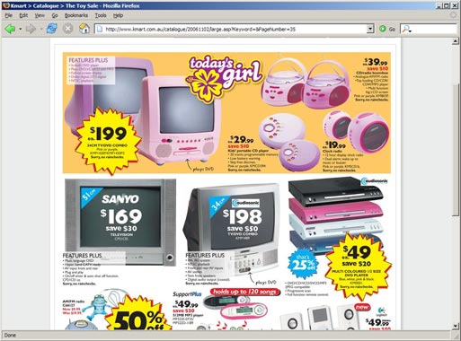
The Kmart site takes a simple approach of using JPEG files of the catalogue. Every web browser can display JPEG files; there was no need to download any plug-ins.
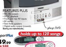
I was initially presented with a thumbnail of each double-page spread of the catalogue. When I clicked on a “page” of the catalogue, I was taken to a larger image of that page (as shown in the screengrab above). The fineprint is just legible to me (see actual size sample on the right).
The large image uses up most of the available screen real estate which is great (the more useful content I see, the better). On a 17” monitor or larger, I would see more blank margins on either side. There were also links to PDFs of each page I can download and print. File sizes were optimised for the web and downloaded quickly.
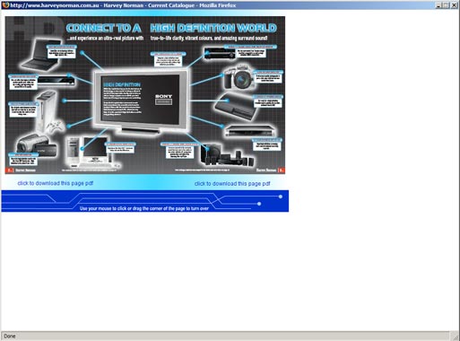
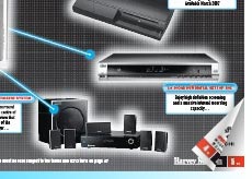
The Harvey Norman site uses a Flash movie to display the thumbnails. If I did not have a recent Flash plug-in, I would have had to download it before I can view the catalogue.
As shown in the screengrab, most of the screen real-estate is wasted. The designer has made the Flash movie small enough to fit into the smallest likely screen resolution out there (which is 800x600 pixels). Unfortunately, more people have a 1024x768 or 1280x1024 screen, so they get to enjoy loads of useless white space.
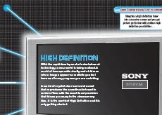
It gets worse from here. The fineprint is completely illegible in the Flash movie (see actual size sample on the right). I can’t zoom in to see the details or read the text. The PDF download links don’t work (I got blank pages after waiting for the download).
Ok, next challenge. How do I turn the “pages”? The just-legible instructions at the bottom says “use your mouse to click or drag the corner of the page to turn over”. “Click” and “drag” are two different user interface concepts. But that is possibly me being overtly pedantic.
So just where is the “corner” of the page? I tried the bottom-right corner; nothing. The corner of the window (ie the web “page”); nothing either. Clicking on the actual page I wanted to turn (which I would have thought is the most obvious thing to do); nothing. As I moved the mouse around, I suddenly discovered the hidden control. When the mouse is hovering over what looks to be the page numbers (the tiny red blocks with the white splotches in them), a b-e-a-u-t-f-u-l page curl animation shows that a page turn is indeed possible, if I click.
Legibility and usability issues aside, the Flash piece is very well done. I could actually grab the edge of a page and drag it left and right to partially turn a page – almost like a real paper catalogue. But I doubt the point of the exercise is to mimic a paper catalogue.
Which brings us back to the key learnings:
- Get clear on what you are trying to achieve, and make sure the outcomes meet these goals. In this case, the basic goal is to give web users access to the contents of the paper catalogues.
- Understand the media you are using, and design your content to suit the strengths and limitations of each. Flash can be put to better use as animated illustrations perhaps, something that is not possible on the paper catalogues.
- Do not be distracted by pretty things, which can turn out to be annoyances and obstacles in disguise. (Don’t blindly use some cool technology just because you can.)