This post is an extended response to my comment on David Hill's post: The Art of Thin.
In our marketing/advertising/image obsessed world, it is often easy to mistake initial visual "wow" appeal for good design. We as consumers have been, and are continued to be trained to think of good design as just looking funky or looking different for its own sake.
Take this funky piece of design I own: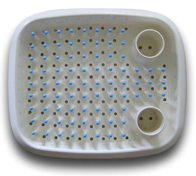
It is an acclaimed Marc Newson dish drainer. VERY funky to behold. Looks fabulous.
But it does not work terribly well, certainly not compared to the traditional X-rack with the parallel slots. The grid of "match heads" are not spaced to hold plates neatly. Bowls and non-plate items tend to sit precariously on top of the "match heads", I often have to really jam things down.
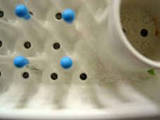
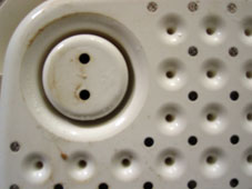
And cleaning this thing is next to impossible. The spacing of the "match heads" means it is impossible to get my hand or any brush implement, down in between them to scrub out the crud (left picture below). And as the "match heads" are (beautifully) moulded from a single piece of plastic, they create these deep pockets underneath where things can grow (right picture).
Yes, sticking the whole thing into a dishwasher will clean it all out! Perhaps this appropriately highlights the target market for this piece of design - it is for people who already have a dishwasher to do the real work.
Good design is only obvious after the fact. And is most noticeable by its absence. It is easy to say something is a piece of "good design"; but it is only in the use of the thing, day in day out, that is truly telling.
I like nice looking things. AND I also like them to work, to support me in what I need to do.