When you sign the front of a building, the key bit of information users would want is the number. This is especially true on a long main street such as Elizabeth Street in Sydney.
Despite it being executed on a flat surface, designing effective signage requires an appreciation of 3D space. It is more than graphic design.
This sequence of photos shows the unfortunate results of what happens when a designer works on a signage project without a clue of what is around the final piece.
I am walking down Elizabeth Street looking for number 410. I think I am close but am not sure which is the doorway to the building. Could this be it?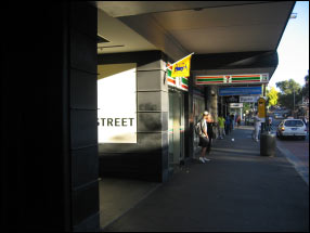
Or have I overshot it? Why tell me what I already know - I am on Elizabeth Street. But is this 410?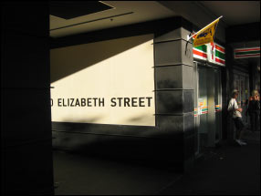
Oh yes it is. When I peer into the entryway and see the number, tucked as far away from visibility as possible!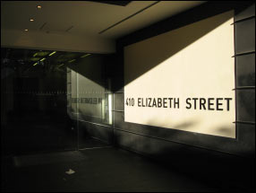
Had the designer been aware of the surrounding environment, instead of merely looking at a white flat surface of x-y dimensions, he/she would probably have come up with the following, more usable, solution.
Good signage is about easy wayfinding, not exploration!